
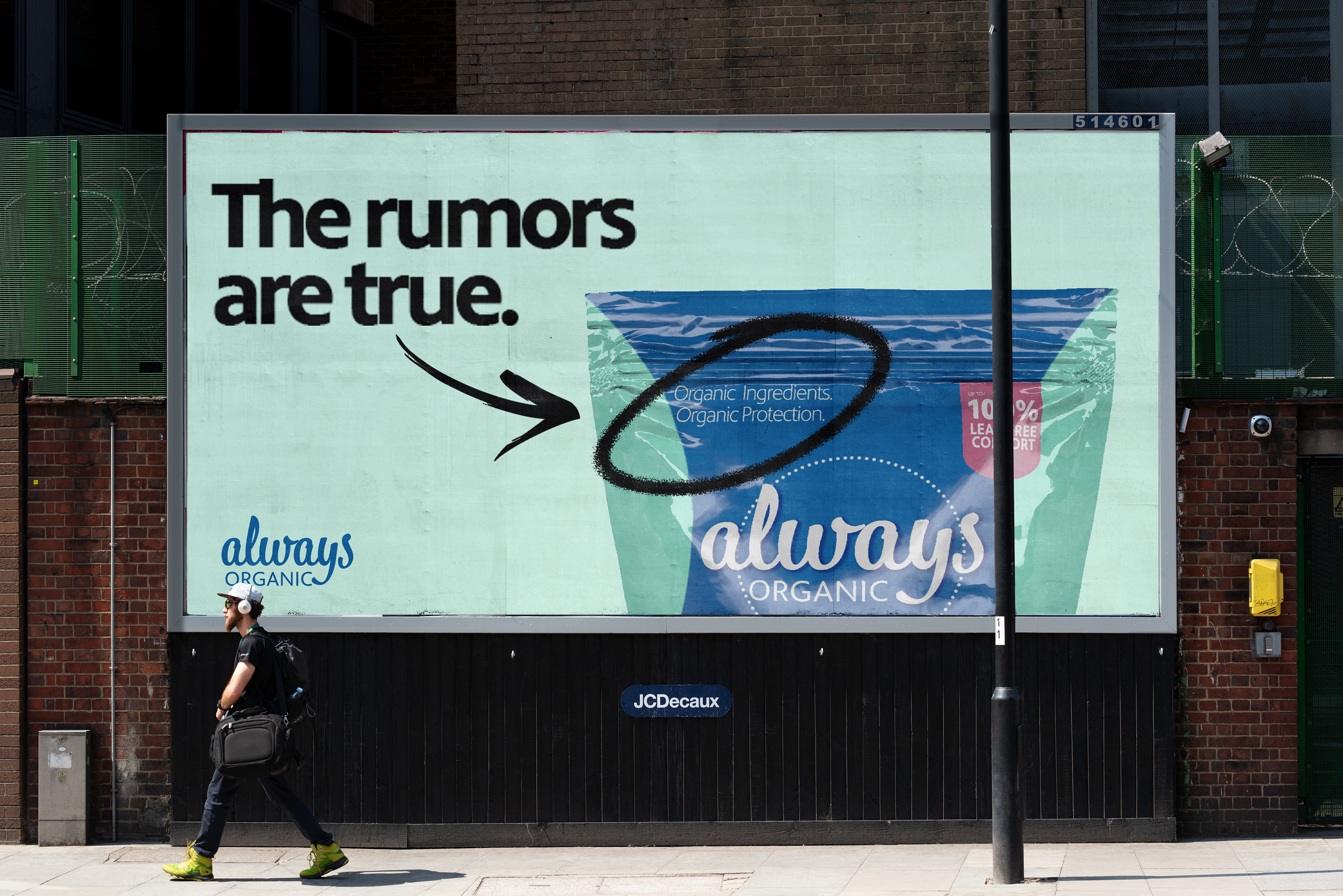
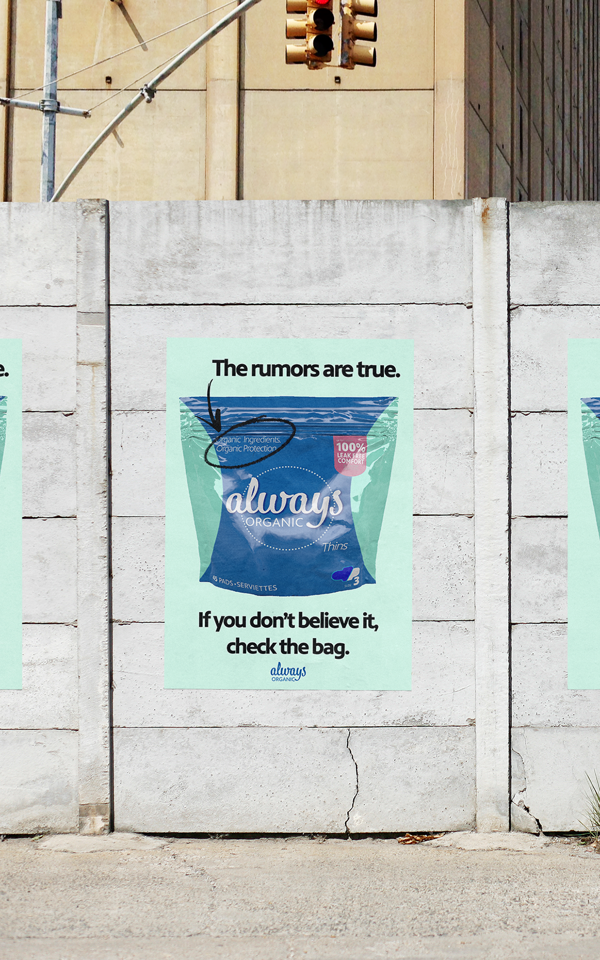
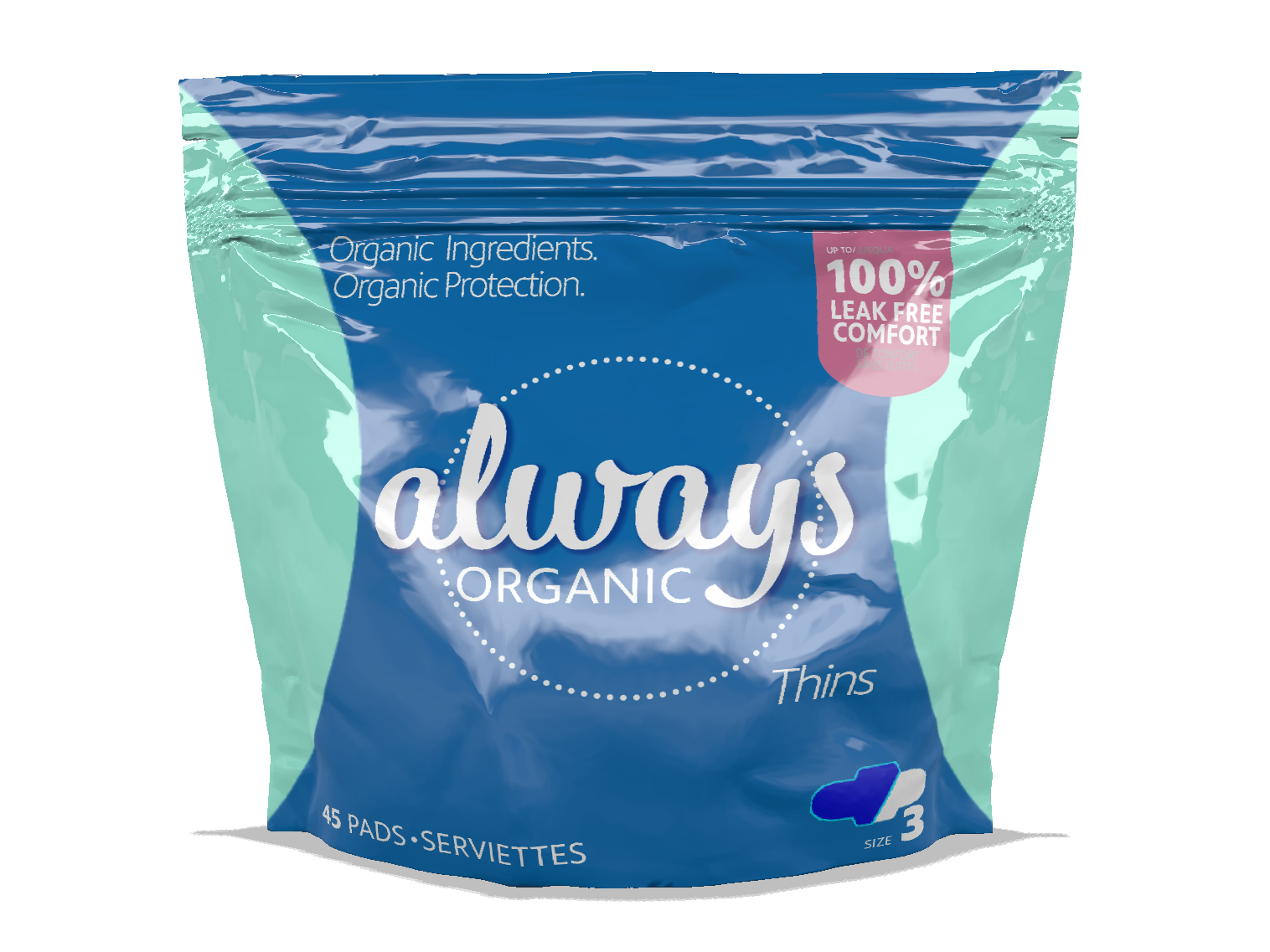
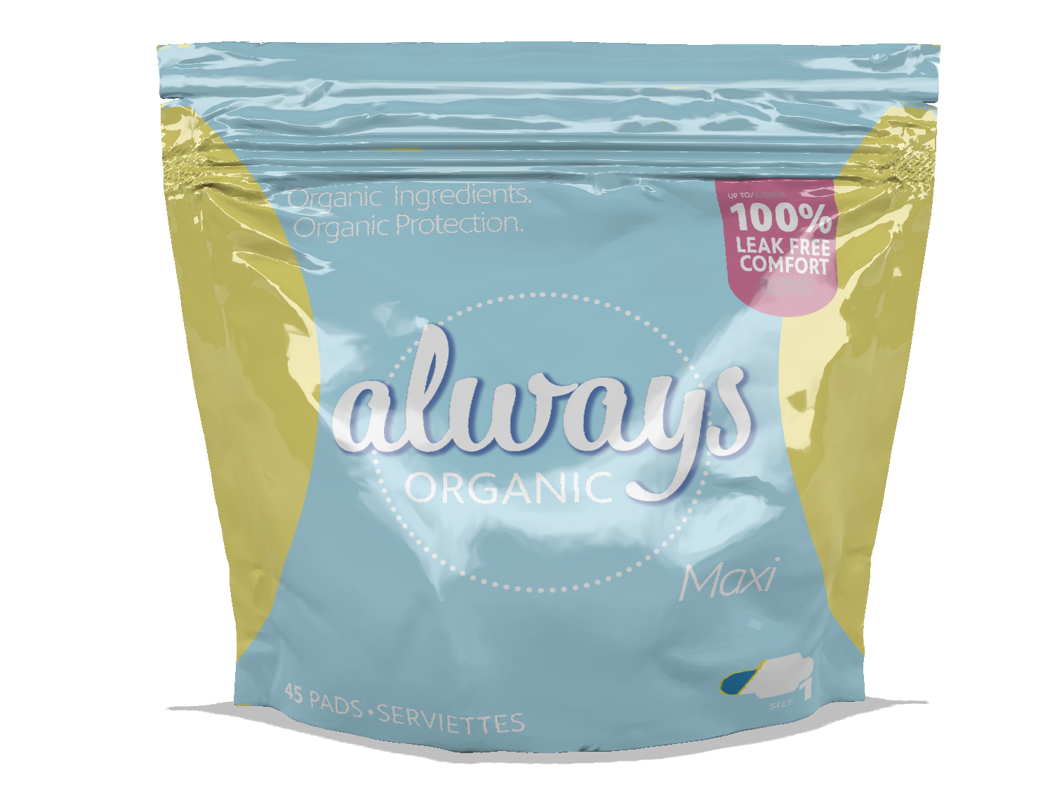
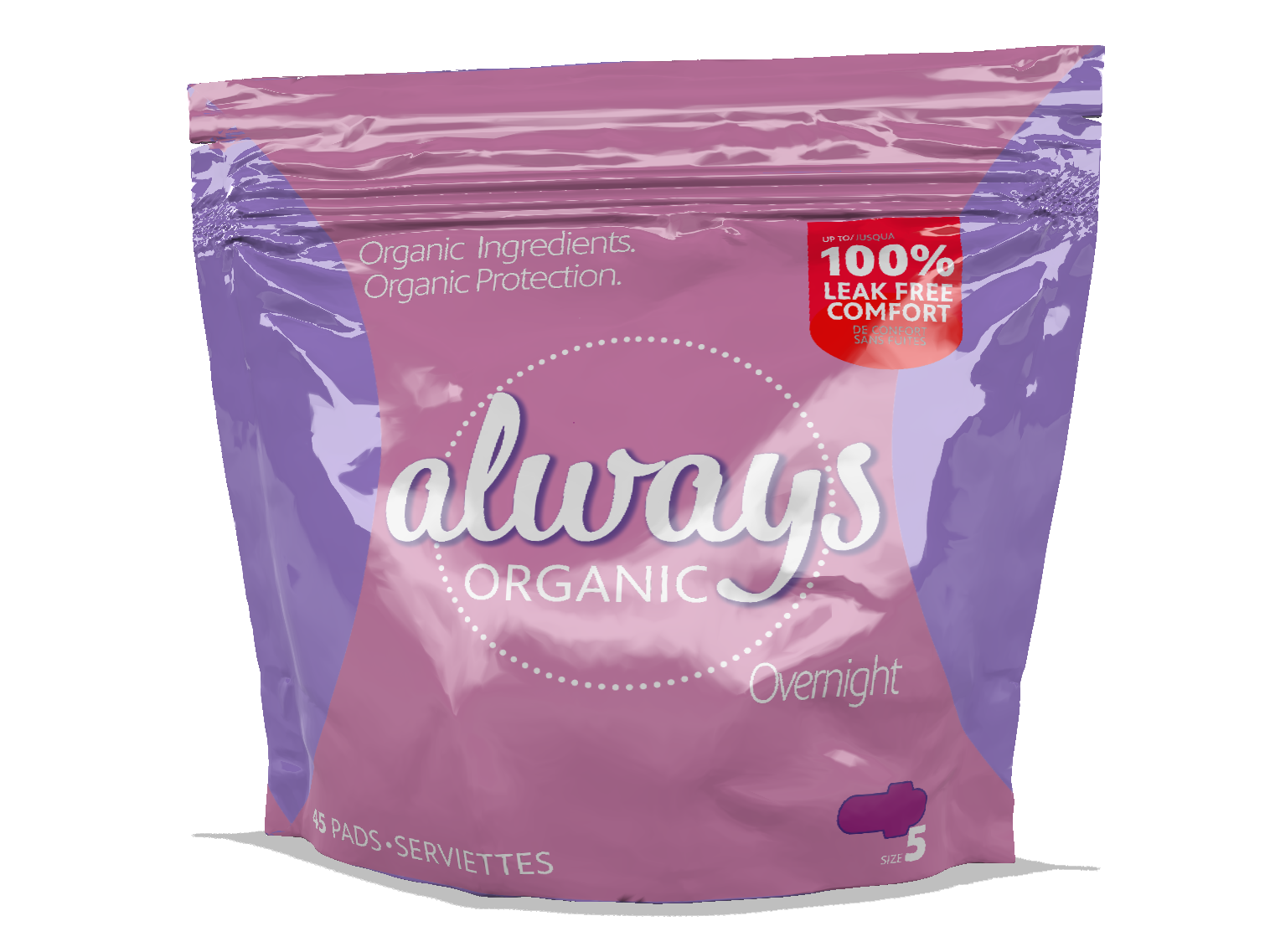
Ever felt the invisible spotlight at the checkout? We've been there. It's time to change that narrative. Always is a brand that I have grown up with. I remember the feeling I had during every purchase. Being that these are menstrual products I felt this old companion deserved an upgrade. The packaging has been adjusted to make young women feel more comfortable while purchasing intimate products during a time where most women & girls already feel pretty uneasy.
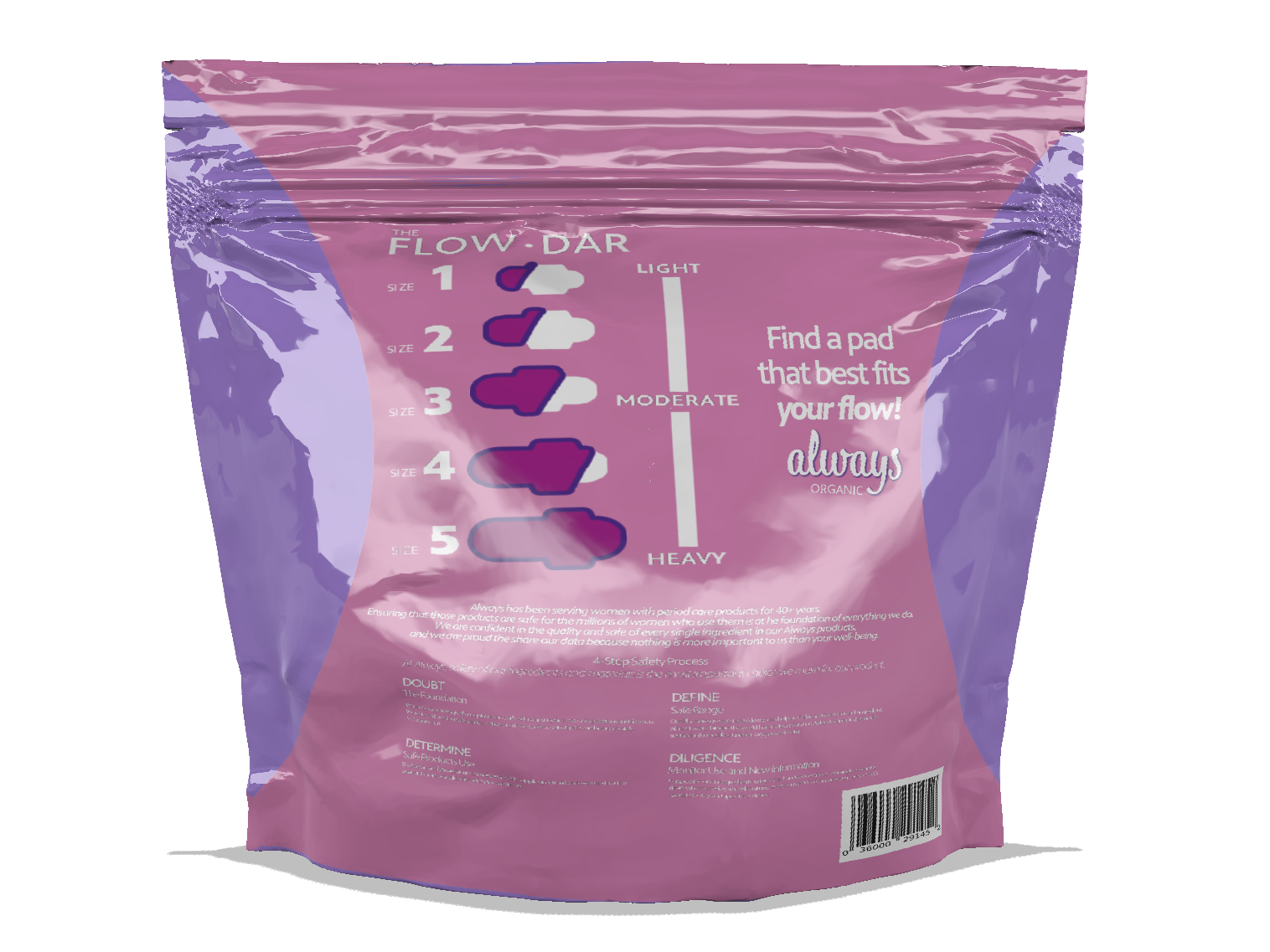
Along with the emphasis of comfort, I wanted Always to step into the modern era of health-conscious choices. With my organic approach, I did not just redesign packaging; I am trying to redefine the period experience. Always also does not have any organic items amongst any of their product line. Natural products are what many audiences today are interested in, me included. This package design and advertising campaign was created to give an old friend new wraps and modernize its overall image and brand identity.
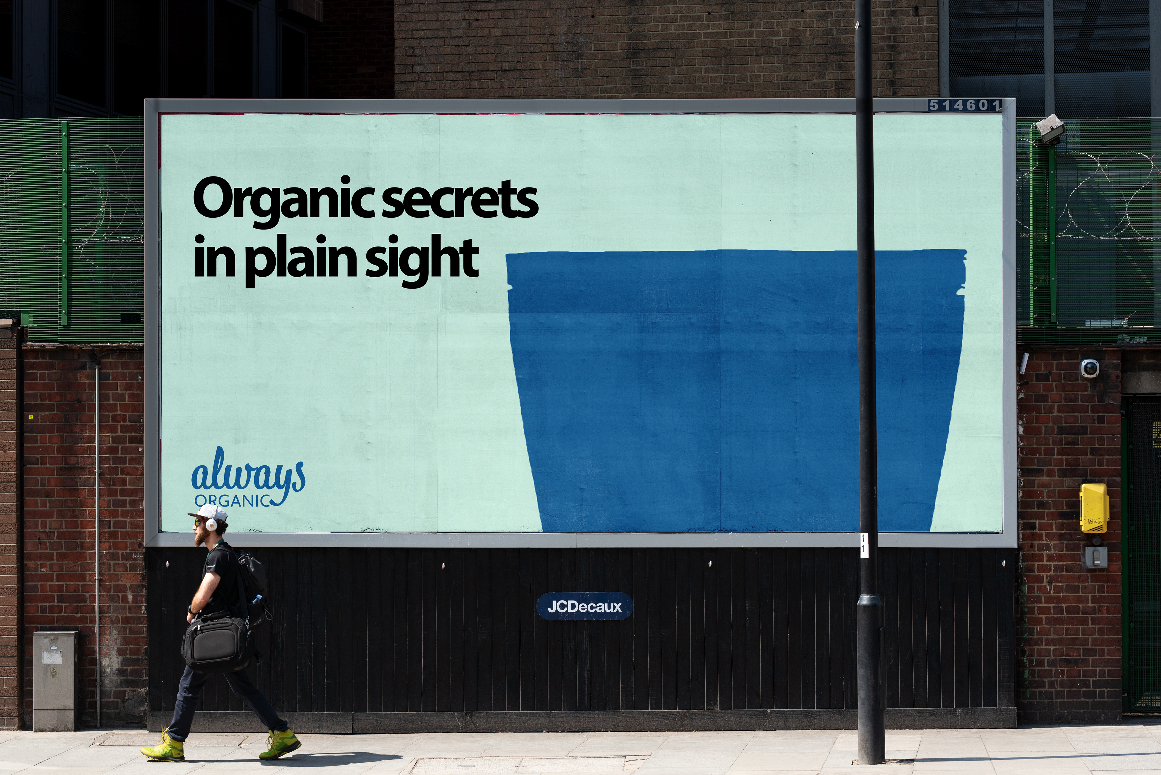

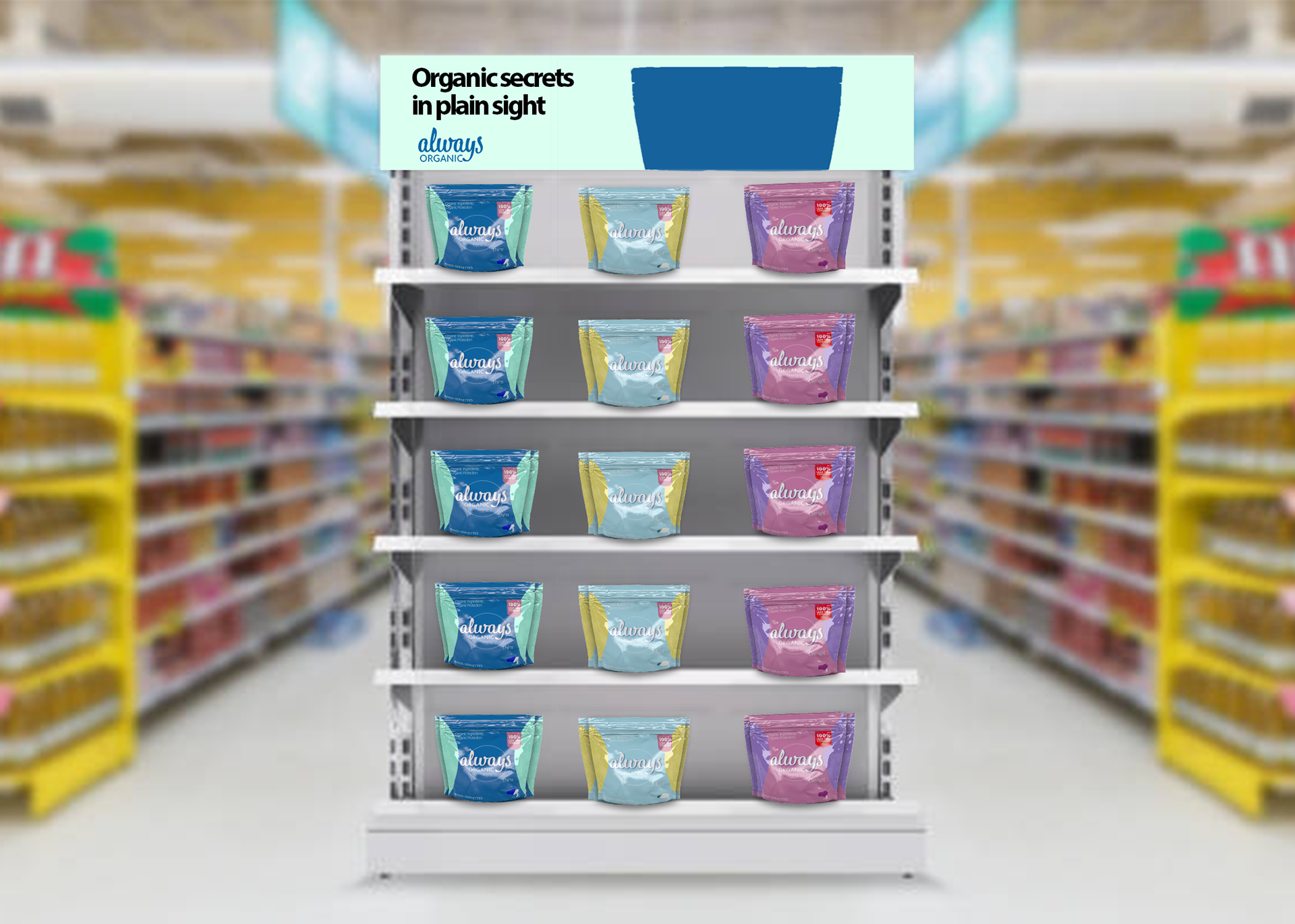
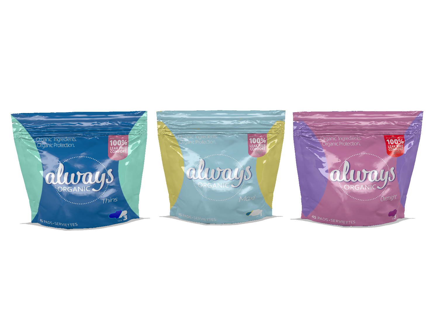
This campaign isn't just about a new look—it's about redefining the period experience and bringing Always into the modern era of health-conscious choices.
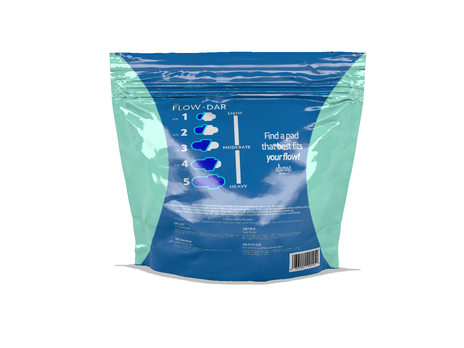
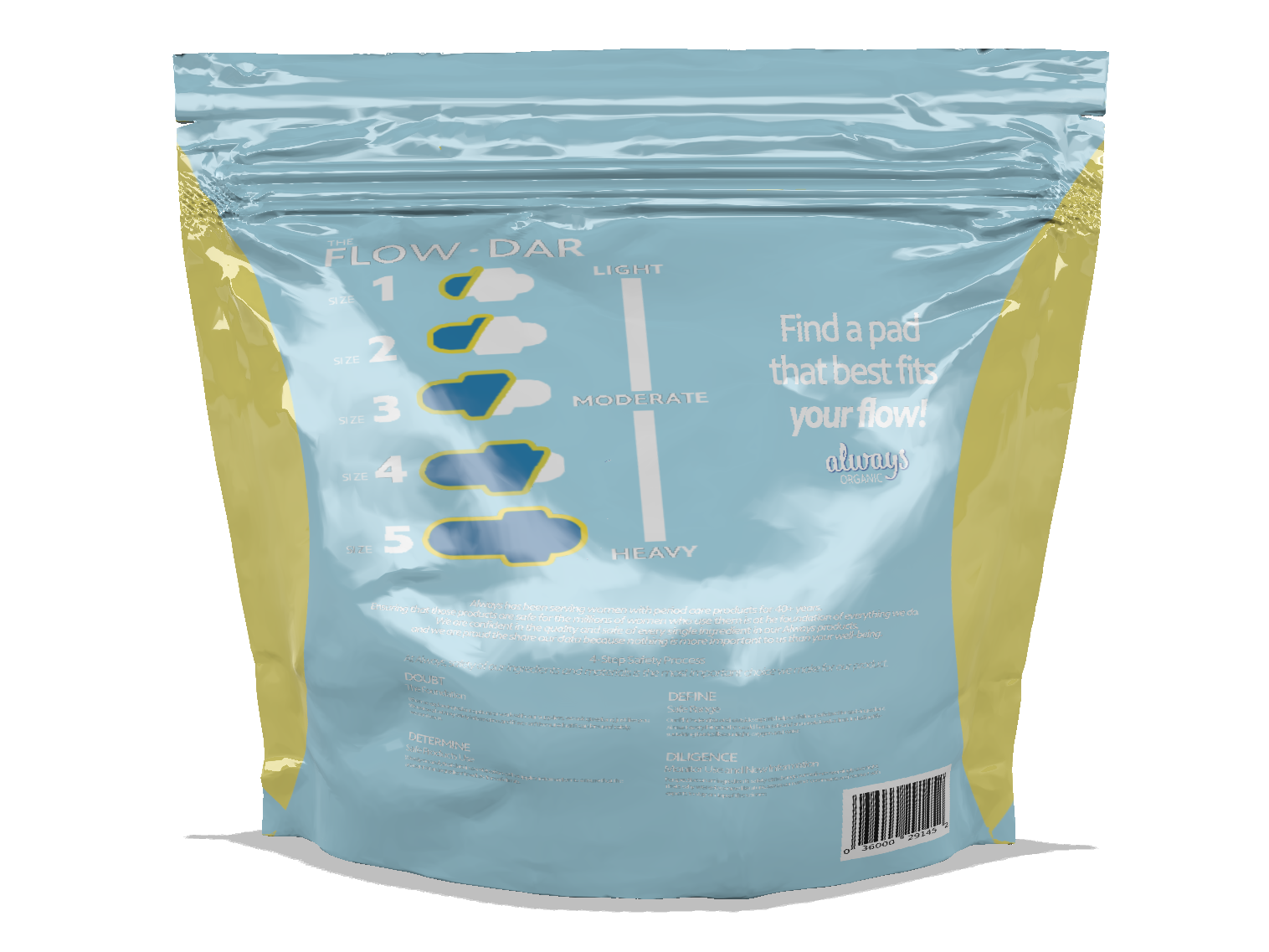
This Always' package design was rendered in a 3D layout via Adobe dimensions. I was able to create this layout by manipulating space, environment, lighting and multiple 3-dimensional platforms.